Building Alpine Private Wealth from First Principles
When Alpine Private Wealth first came to us, there was no brand to refine or website to redesign — just an idea. No name, no visual identity, no digital presence. What existed was a clear ambition: to build a private wealth firm that felt considered, credible, and quietly confident from day one.
Our role was to take that early vision and give it form. From naming and brand strategy through to visual identity, website design, and full development, we partnered with the client to build Alpine Private Wealth from the ground up, shaping not just how the business looks, but how it presents itself to the world with clarity and conviction.
The Discovery
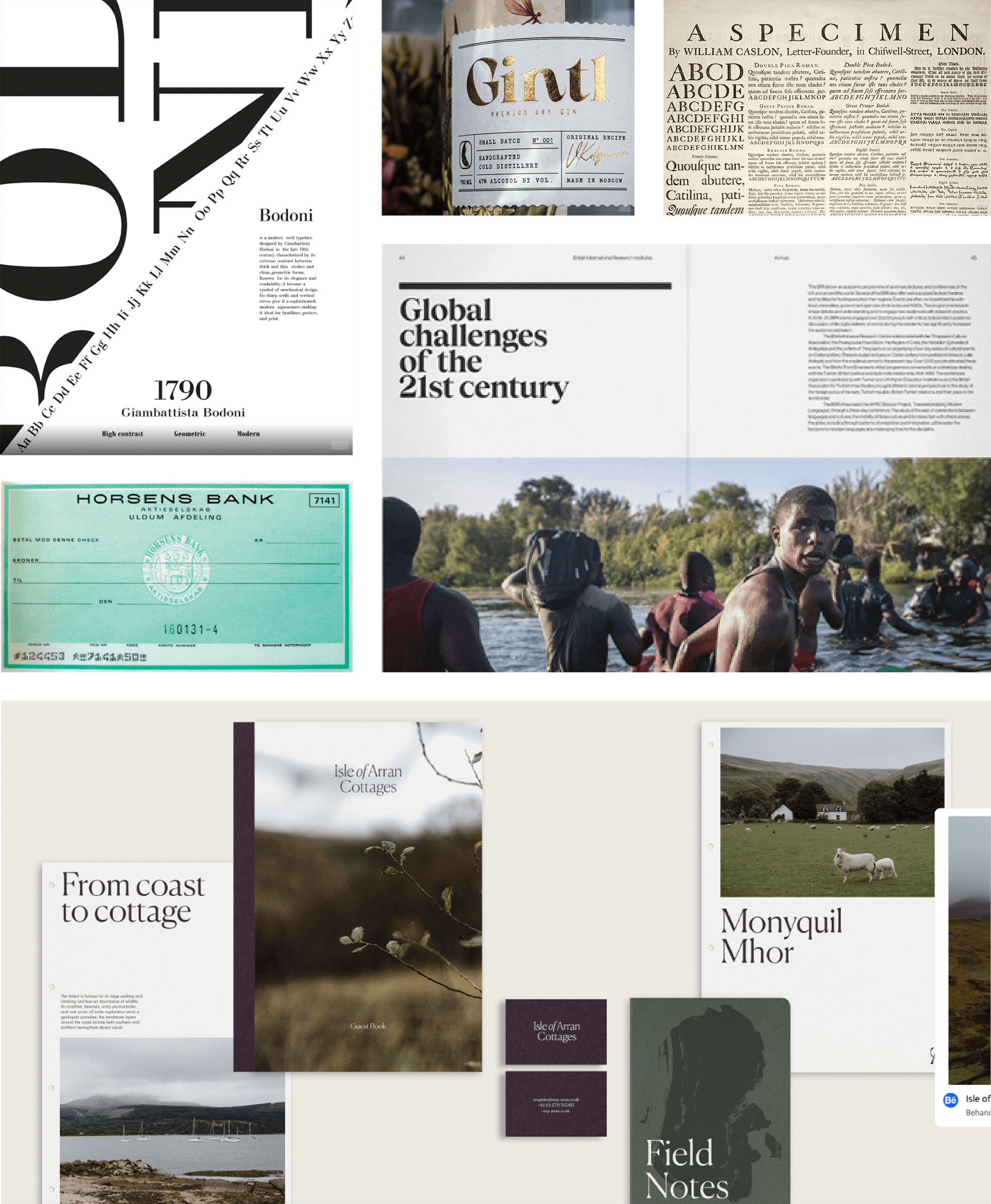
Discovery with Alpine Private Wealth was less about defining a finished aesthetic and more about understanding intent. While they couldn’t articulate what the brand should look like in conventional terms, they arrived with a strong set of references and an even clearer sense of what they didn’t want. Through workshops and discussion, patterns began to emerge — not around status or excess, but around meaning. That insight led us away from traditional wealth tropes and towards a more human expression of value. Rather than centring the brand on money itself, we focused on what wealth enables: freedom, time, experiences, and the ability to live well. This became the foundation for a brand that feels considered, understated, and genuinely aligned with why people seek wealth in the first place.
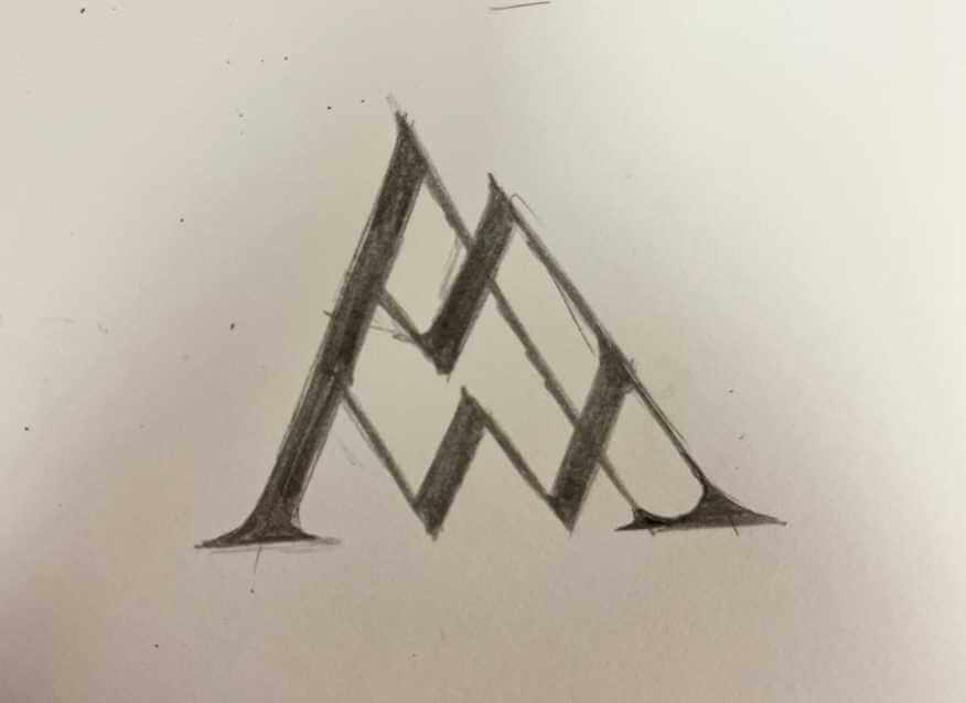

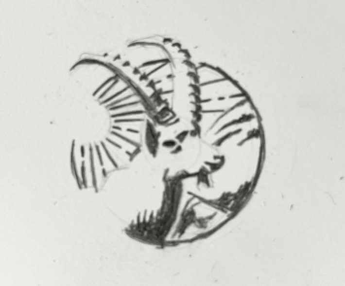
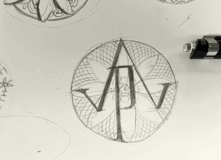
Vintage Luxury meets Modern Simplicity
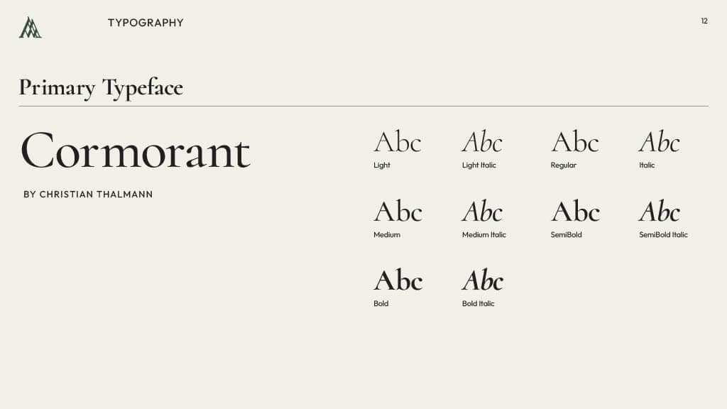
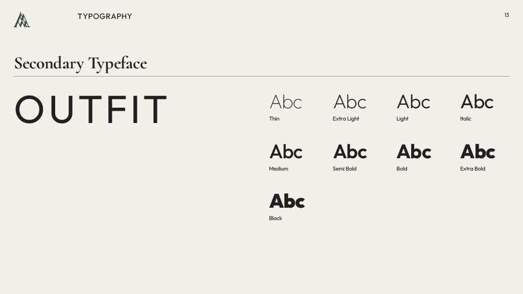
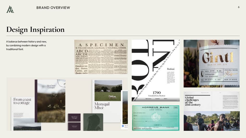
With the goal to create a brand that is a combination of a vintage luxury feel and modern simplicity, we created logo designs that went down two separate avenues: a single-colour traditional ink stamp inspired by Alpine nature, and an Art Deco, geometric symbol. After a variety of designs, a symbol was chosen and refined, and a complementing font pairing was picked.

The non-negotiable: Consistency
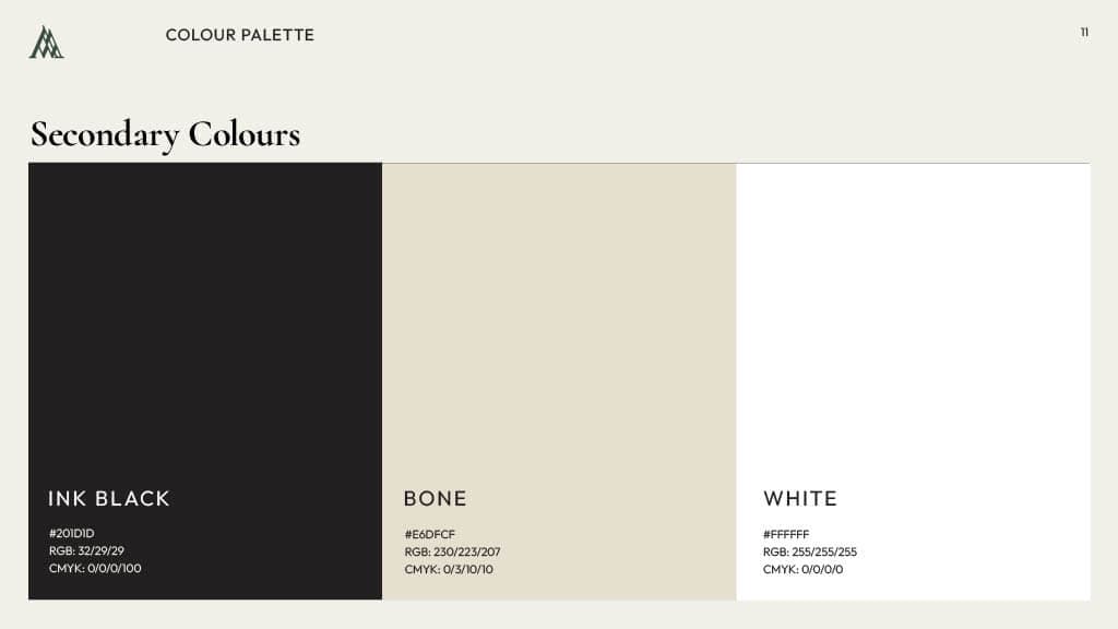
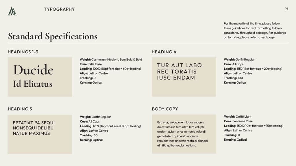
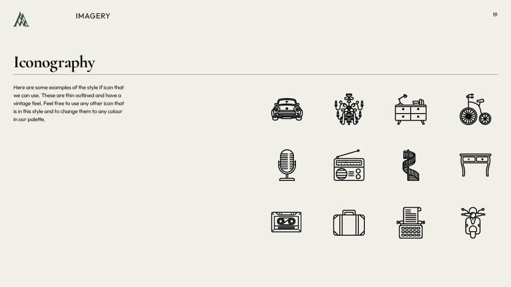
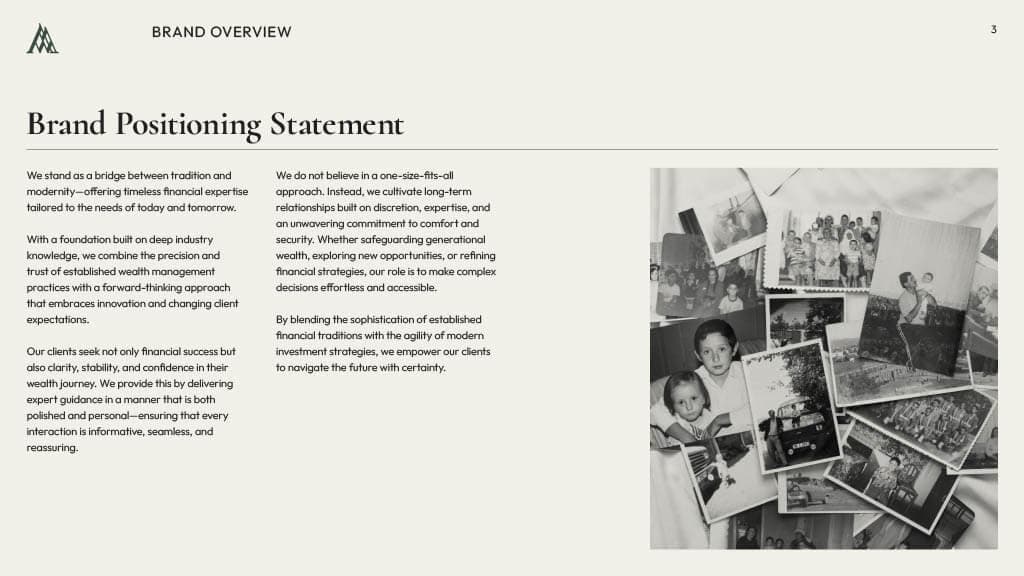
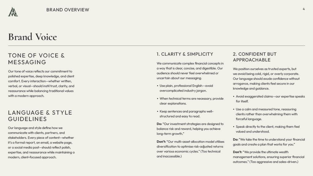
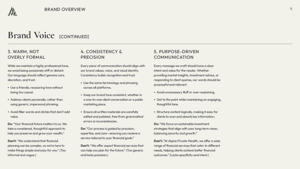
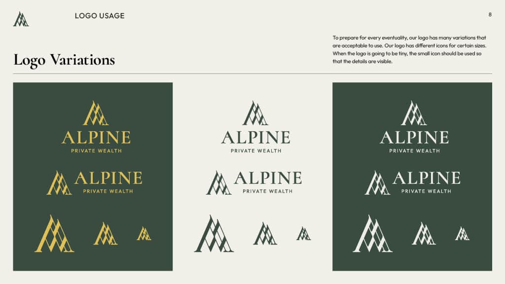
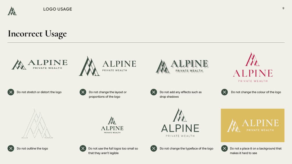
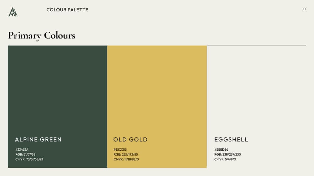
An in-depth Brand Guidelines document was then created to ensure the brand's positioning and style are consistent through all touchpoints. Having this document allows anyone to create assets that feel truly Alpine, giving a better experience to their clients.
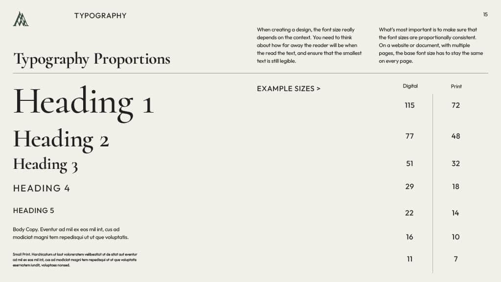
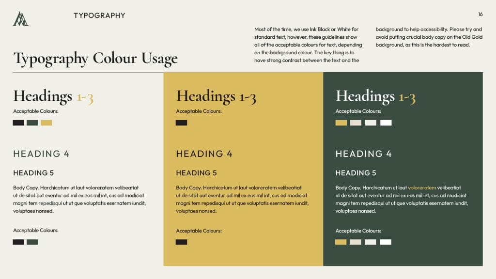
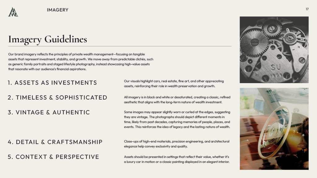
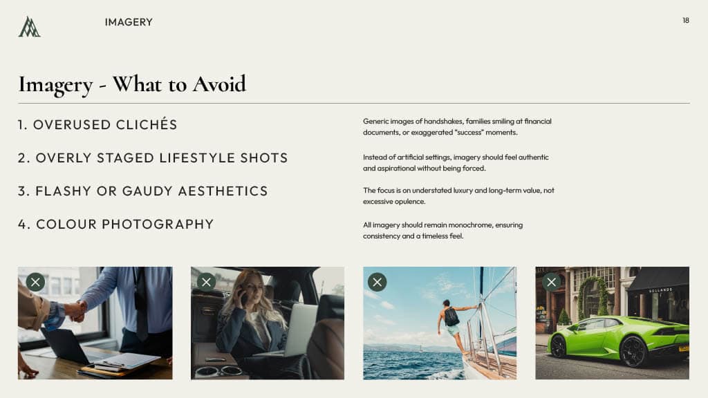

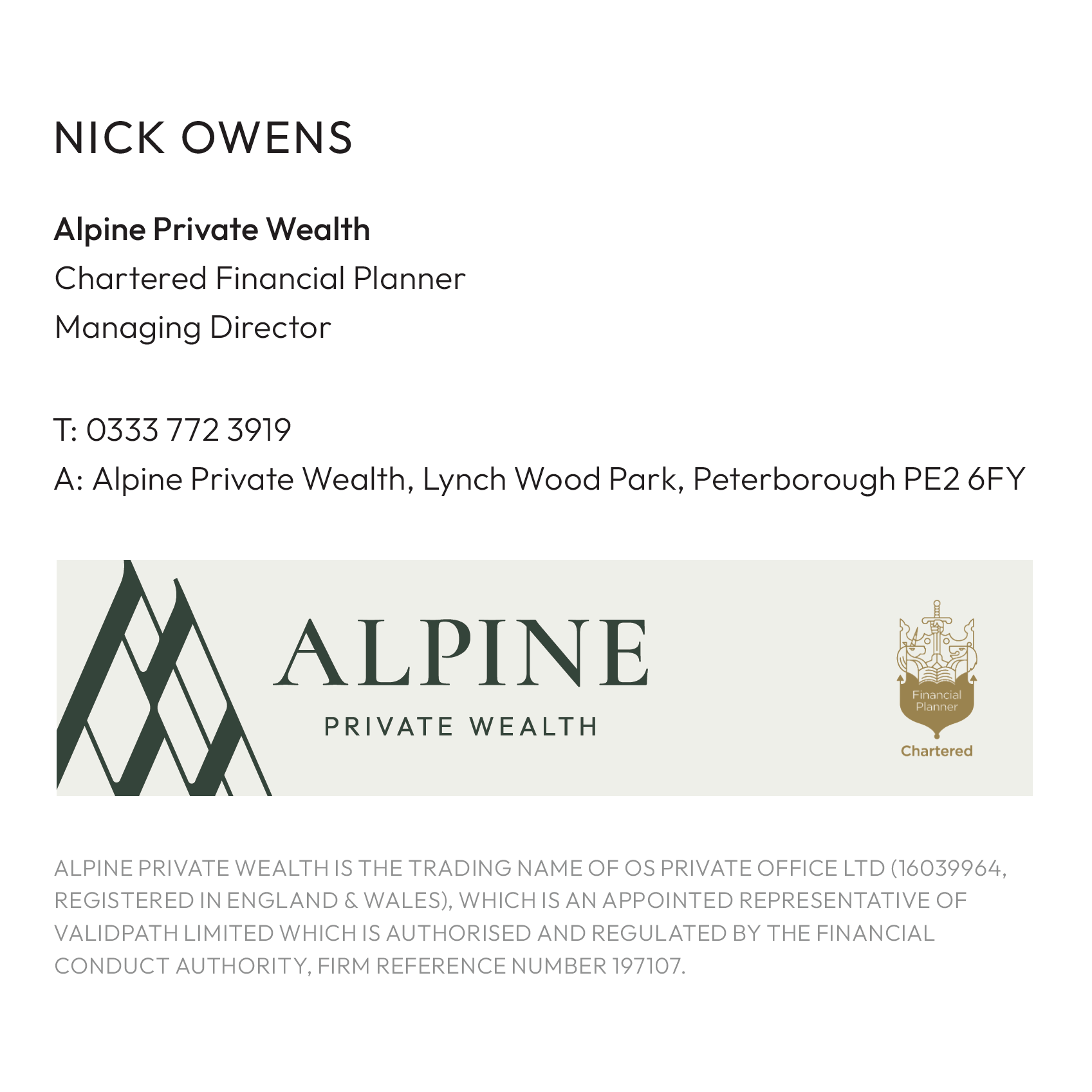
Email Signature
An in-depth Brand Guidelines document was then created to ensure the brand's positioning and style are consistent through all touchpoints. Having this document allows anyone to create assets that feel truly Alpine, giving a better experience to their clients.
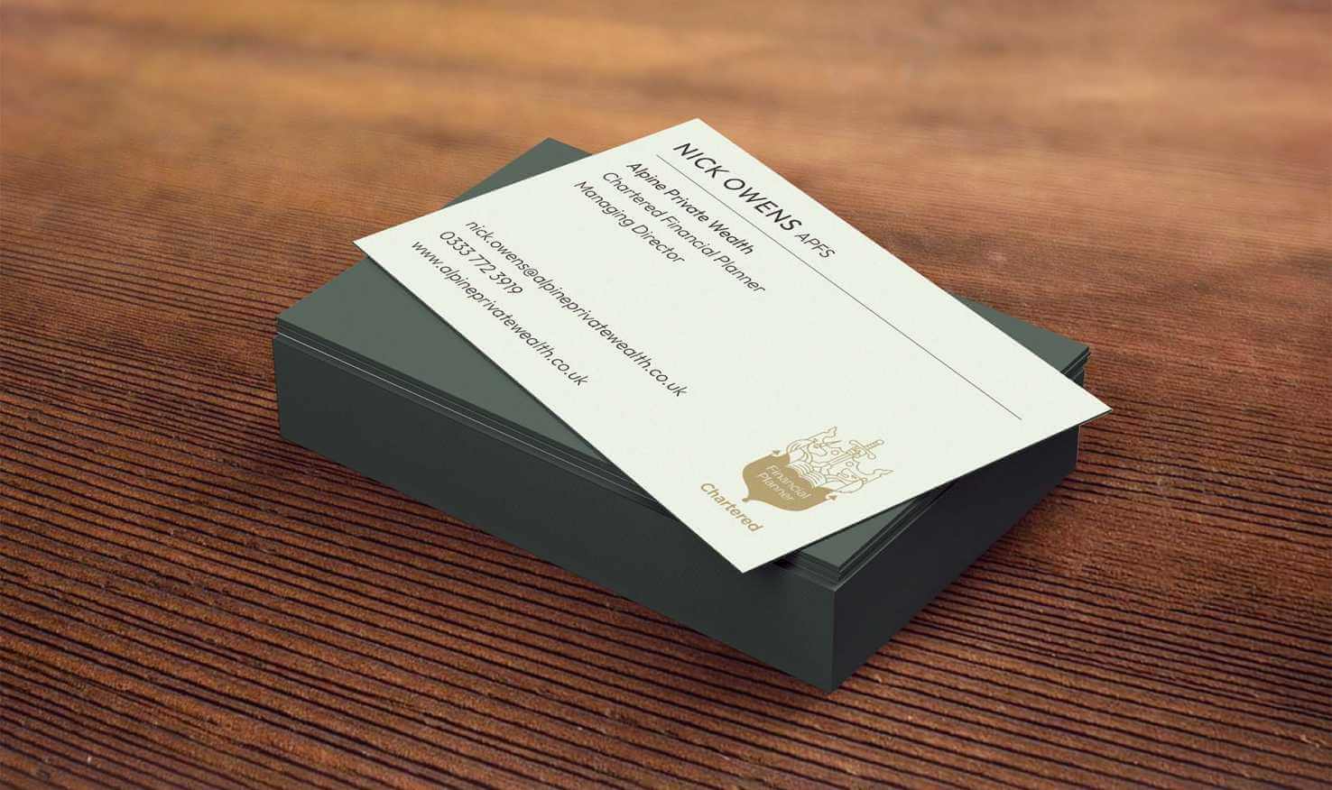
Business Cards
The quality of the print and the weight of the card are just as important as the design of a business card. With the goal to have a high-end feel, we recommended a matte finish with a gold foil logo in the centre.
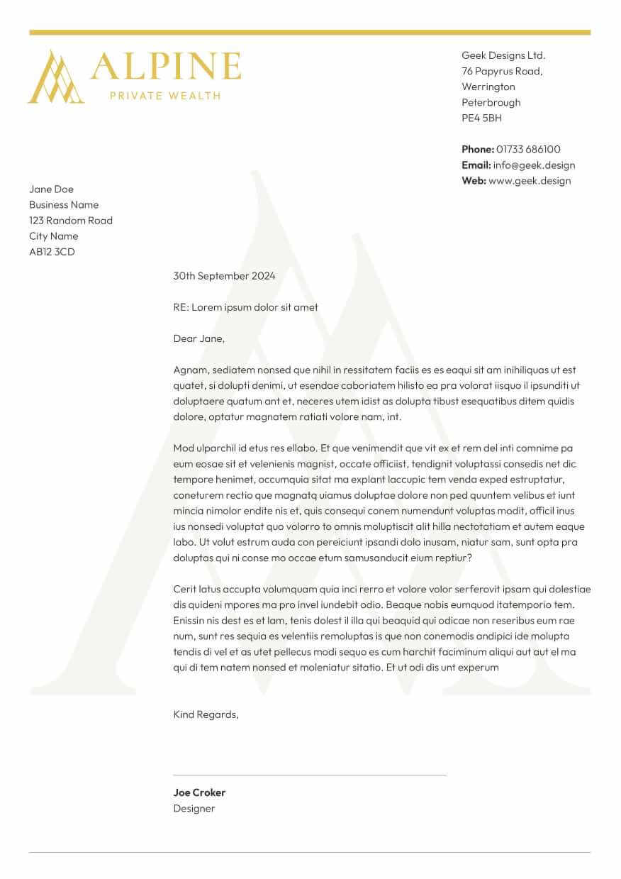
Documents
For Alpine, the design of their printed documents is key, as this is one of the most common ways a client will be interacting with the brand. We created multiple templates for various types of documents with the branding applied.
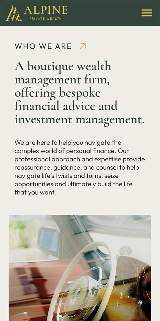
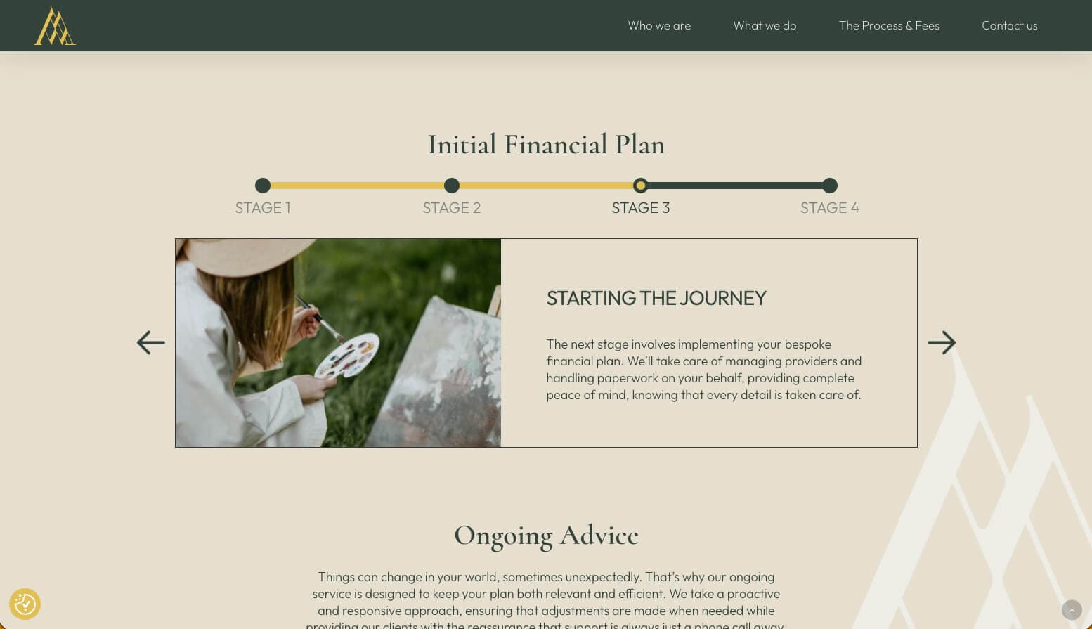
Starting with Branding, ending with Web Design
The branding was then translated to a small information-based website where potential clients can learn what Alpine Private Wealth can offer and get in contact. For this, we worked on the content to ensure the tone of voice and messaging were consistent throughout, and the user journey of the website was easy to follow.